
创建一个项目
注:
① ArkTS 采用声明式开发规范。
一、基础结构认识
注:每一个页面,也就是一个组件。
ets
@Entry // 标注当前模块入口
@Component // 组件,可以省略,但是组件的时候,可以写着
struct Style { // struct 默认是组件,所以 @Component 可以省略
  build() { // 必须有这个,因为他是用来构建组件的
    Text('测试文本').fontSize(20).fontColor('red').width('100%')
  }
}
二、UI
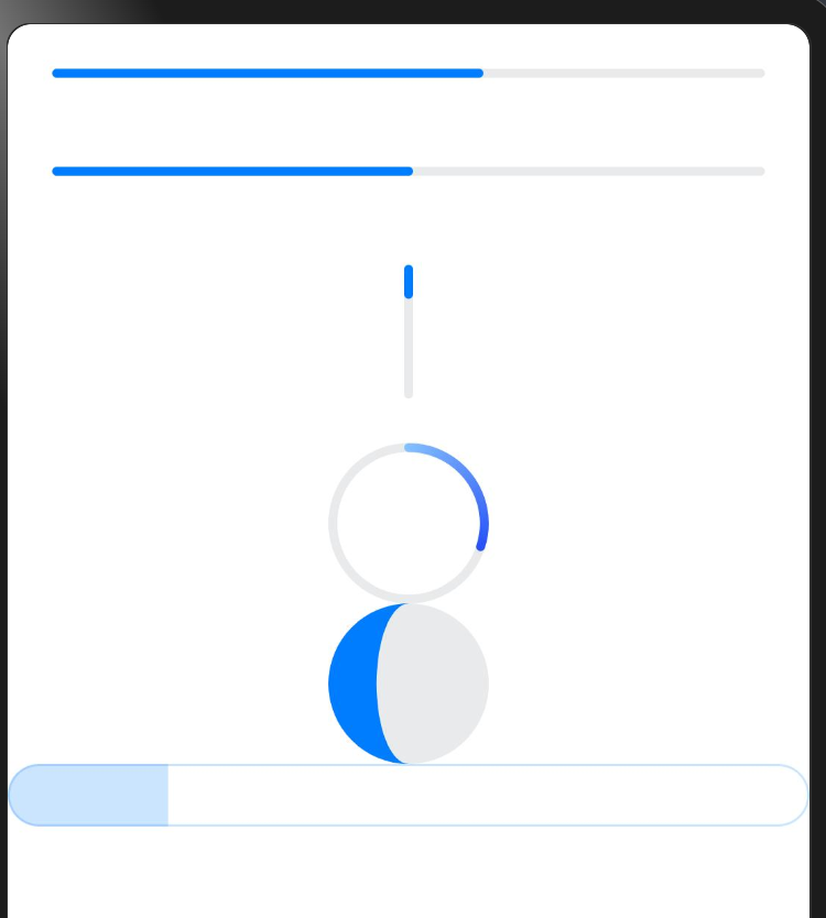
1、进度条
ets
@Entry
@Component
struct Style {
  build() {
    Column() {
      // 进度条
      Progress({ value: 60 }).margin(20)
      Progress({ value: 50 }).margin(20)
      Progress({ value: 60, total: 300 }).margin(20).width(10).height(60)

      Progress({value: 30, type: ProgressType.ScaleRing})

      Progress({value: 30, type: ProgressType.Eclipse})

      Progress({value: 20, type: ProgressType.Capsule})
    }
  }
}
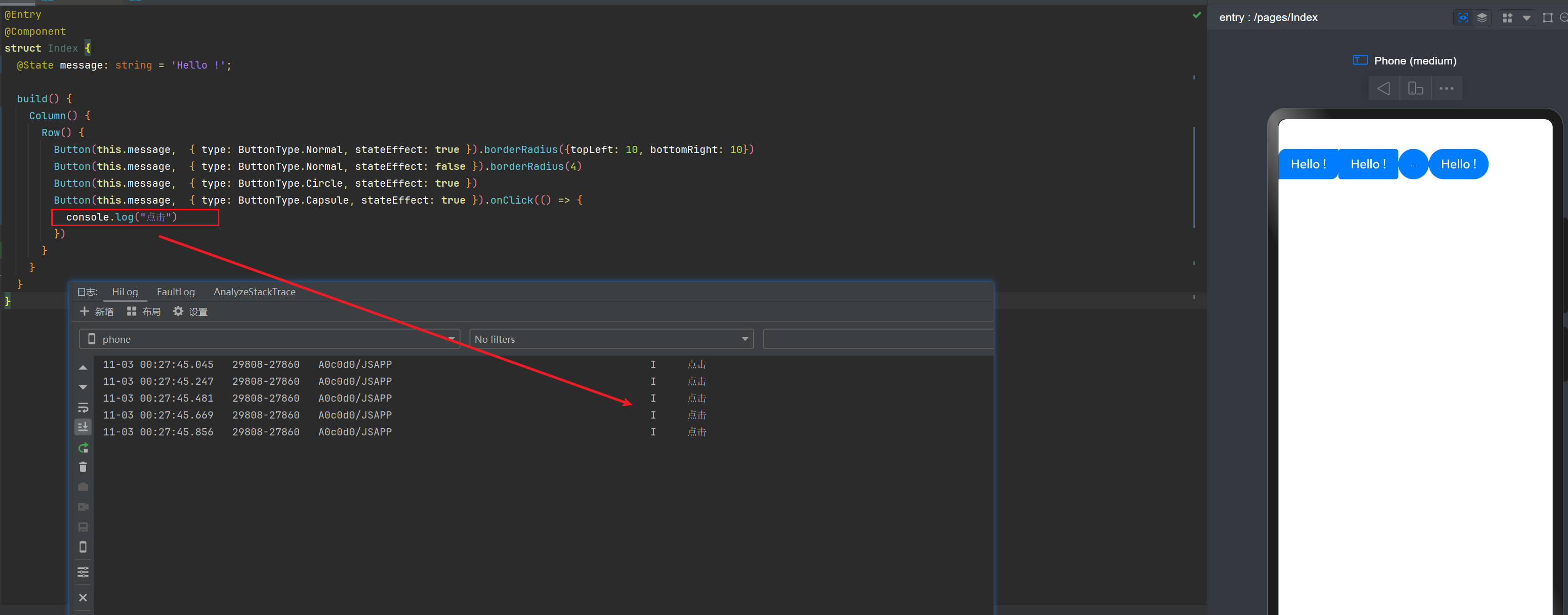
2、Button
ets
@Entry
@Component
struct Index {
  @State message: string = 'Hello !';

  build() {
    Column() {
      Row() {
        Button(this.message,  { type: ButtonType.Normal, stateEffect: true }).borderRadius({topLeft: 10, bottomRight: 10})
        Button(this.message,  { type: ButtonType.Normal, stateEffect: false }).borderRadius(4)
        Button(this.message,  { type: ButtonType.Circle, stateEffect: true })
        Button(this.message,  { type: ButtonType.Capsule, stateEffect: true }).onClick(() => {
          console.log("点击")
        })
      }
    }
  }
}
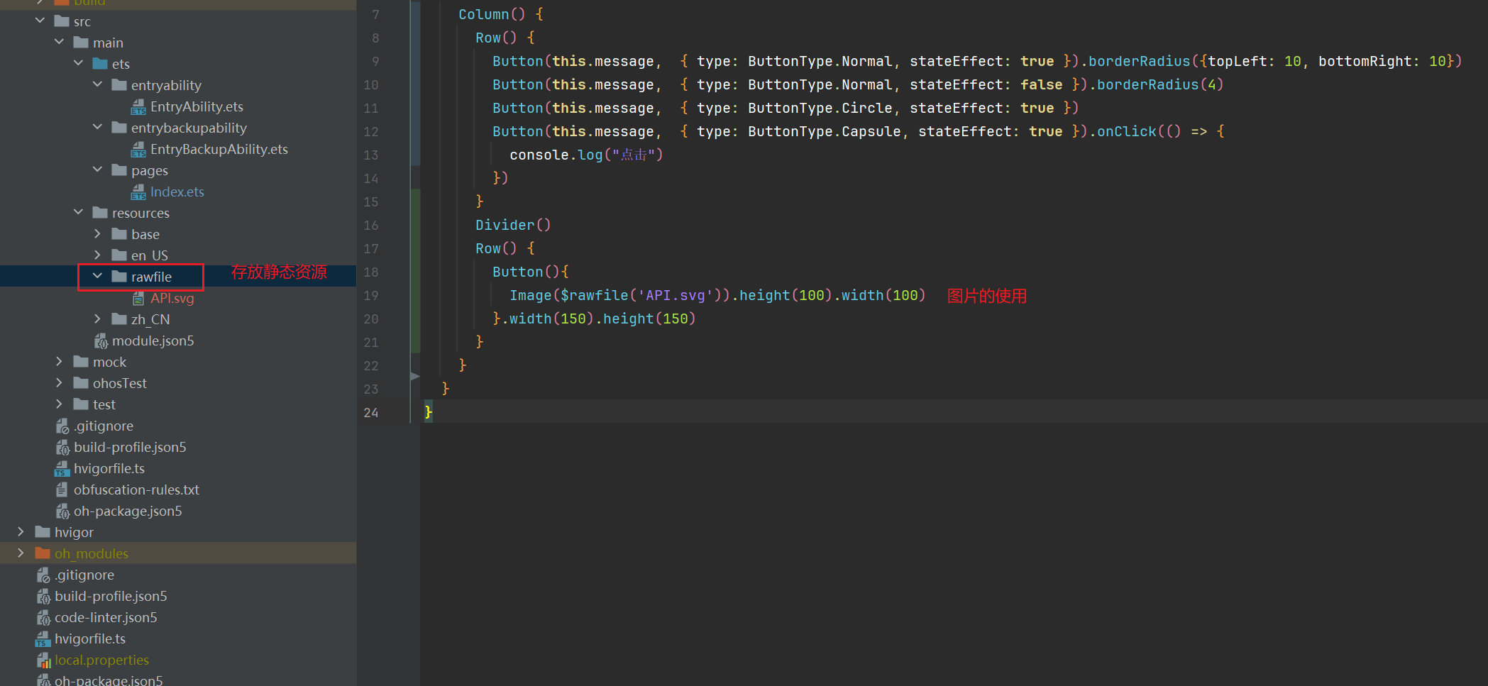
3、Image 的使用
eetc
@Entry
@Component
struct Index {
  @State message: string = 'Hello !';

  build() {
      Button(){
        Row() {
          Text(this.message)
          Image($rawfile('API.svg')).height(100).width(100)
        }
      }.width(150).height(150)
  }
}
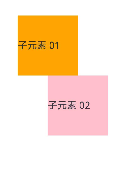
4、相对布局
etc
@Entry
@Component
struct Index {
  build() {
    RelativeContainer() {
      Text('子元素 01')
        .id('box-01')
        .backgroundColor(Color.Orange)
        .width(100)
        .height(100)
        .margin({ left: 50, top: 100 })
      Text('子元素 02')
        .backgroundColor(Color.Pink)
        .width(100)
        .height(100)
        .alignRules({
          left: { anchor: 'box-01', align: HorizontalAlign.Center },
          top: { anchor: 'box-01', align: VerticalAlign.Bottom }
        })
    }
  }
}
5、栅格布局
etc
@Entry
@Component
struct Index {
  build() {
    GridRow() {
      GridCol({span: 11, offset: 1}) {
        Text('1').borderWidth(1).width('100%')
      }
      GridCol() {
        Text('2').borderWidth(1).width('100%')
      }
      GridCol() {
        Text('3').borderWidth(1).width('100%')
      }
      GridCol() {
        Text('4').borderWidth(1).width('100%')
      }
      GridCol() {
        Text('5').borderWidth(1).width('100%')
      }
      GridCol() {
        Text('6').borderWidth(1).width('100%')
      }
      GridCol() {
        Text('7').borderWidth(1).width('100%')
      }
      GridCol() {
        Text('8').borderWidth(1).width('100%')
      }
      GridCol() {
        Text('9').borderWidth(1).width('100%')
      }
      GridCol() {
        Text('10').borderWidth(1).width('100%')
      }
      GridCol() {
        Text('11').borderWidth(1).width('100%')
      }
      GridCol() {
        Text('12').borderWidth(1).width('100%')
      }
      GridCol() {
        Text('13').borderWidth(1).width('100%')
      }
      // 超出了,就会另起一个十二行
      GridCol() {
        Text('14').borderWidth(1).width('100%')
      }
    }
  }
}
6、媒体查询
ets
import { mediaquery } from '@kit.ArkUI';

@Entry
@Component
struct Index {
  @State col01Width: string = '20%';
  @State col02Width: string = '60%';
  @State col03Width: string = '20%';
  // 帮我们去监听屏幕
  smListener = mediaquery.matchMediaSync('screen and (width>=320vp) and (width<=600vp)')
  mdListener = mediaquery.matchMediaSync('screen and (width>=600vp) and (width<=840vp)')
  lgListener = mediaquery.matchMediaSync('screen and (width>=840vp)')

  // 组件的生命周期方法:组件即将显示 aboutToAppear
  aboutToAppear(): void {
    console.log("组件即将显示")
    this.smListener.on('change', (result) => {
      if (result.matches) {
        console.log('当匹配到 sm 屏')
      }
      this.col01Width = '100%';
      this.col02Width = '100%';
      this.col03Width = '100%';
    })

    this.mdListener.on('change', (result) => {
      if (result.matches) {
        console.log('当匹配到 md 屏')
        this.col01Width = '10%';
        this.col02Width = '80%';
        this.col03Width = '10%';
      }
    })

    this.lgListener.on('change', (result) => {
      if (result.matches) {
        console.log('当匹配到 lg 屏')
        this.col01Width = '20%';
        this.col02Width = '60%';
        this.col03Width = '20%';
      }
    })
  }

  build() {
    Flex({wrap: FlexWrap.Wrap}) {
      Column() {
        Text('左侧文本内容').backgroundColor(Color.Yellow).width(this.col01Width)
      }

      Column() {
        Text('中间文本内容').backgroundColor(Color.Gray).width(this.col02Width)
      }

      Column() {
        Text('右侧文本内容').backgroundColor(Color.Orange).width(this.col03Width)
      }
    }.width('100%')
  }
}
三、API
1、Ability Kit(程序框架服务)
entry/src/main/ets/abilitystage/DemoAbilityStage01.ets
ets
import { AbilityStage } from "@kit.AbilityKit";

export class DemoAbilityStage01 extends AbilityStage {
  onCreate(): void {
    console.log('创建')
  }
  onDestroy(): void {
    console.log('销毁')
  }
}
配置
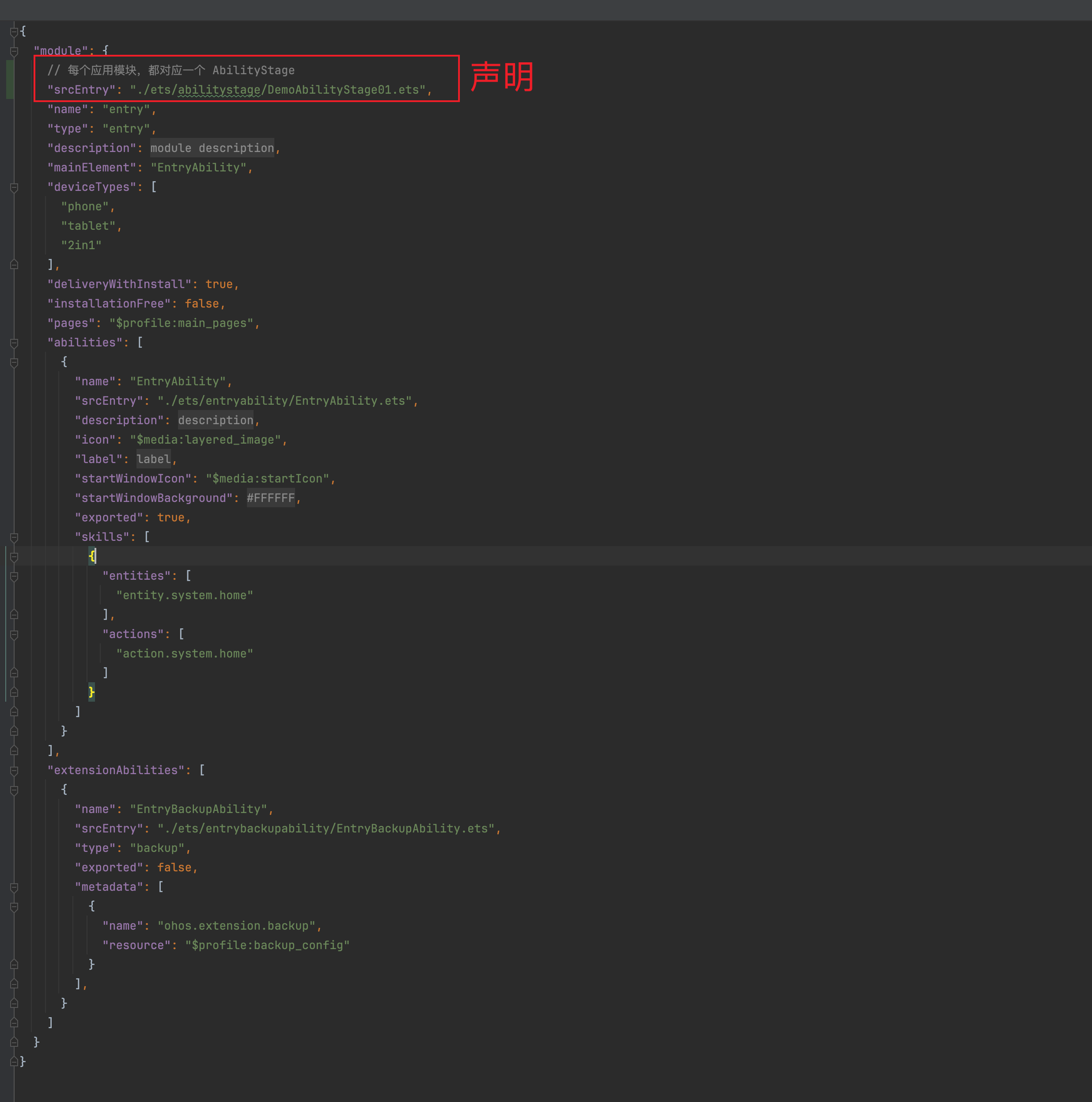
注:在真机模拟器中查看。
2、自定义启动页
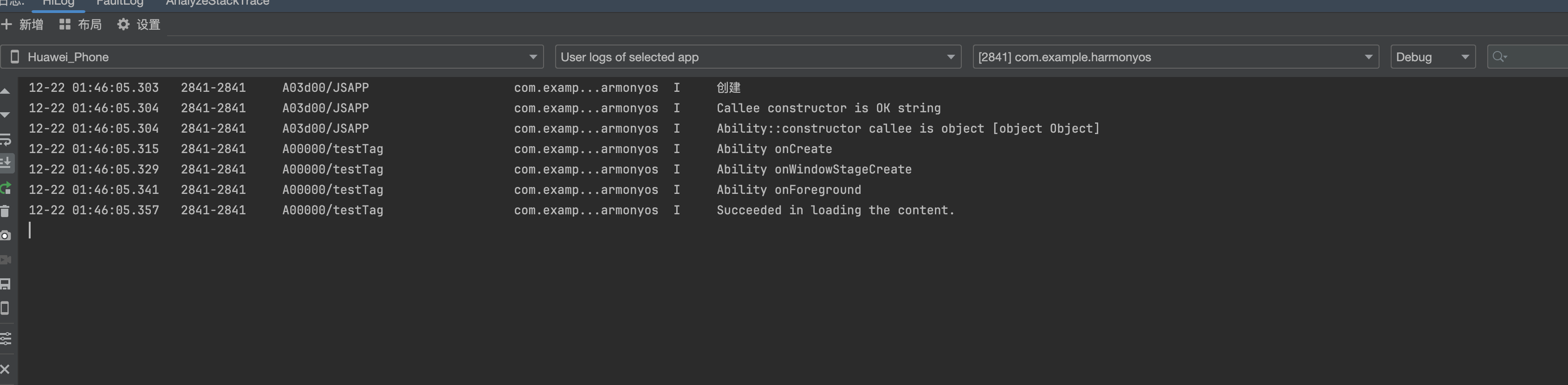
entry/src/main/ets/entryability/EntryAbility.ets
ts
import { AbilityConstant, ConfigurationConstant, UIAbility, Want } from '@kit.AbilityKit';
import { hilog } from '@kit.PerformanceAnalysisKit';
import { window } from '@kit.ArkUI';

export default class EntryAbility extends UIAbility {

  onWindowStageCreate(windowStage: window.WindowStage): void {
    // Main window is created, set main page for this ability
    hilog.info(0x0000, 'testTag', '%{public}s', 'Ability onWindowStageCreate');

  // 设置启动页
    windowStage.loadContent('pages/Router', (err) => {
      if (err.code) {
        hilog.error(0x0000, 'testTag', 'Failed to load the content. Cause: %{public}s', JSON.stringify(err) ?? '');
        return;
      }
      hilog.info(0x0000, 'testTag', 'Succeeded in loading the content.');
    });
  }
}
3、数据同步
1)使用EventHub进行数据通信
使用EventHub进行数据通信:在基类Context中提供了EventHub对象,可以通过发布订阅方式来实现事件的传递。在事件传递前,订阅者需要先进行订阅,当发布者发布事件时,订阅者将接收到事件并进行相应处理。
注册一个自定义事件
src/main/ets/entryability/EntryAbility.ets
ts
import { hilog } from '@kit.PerformanceAnalysisKit';
import { UIAbility, Context, Want, AbilityConstant } from '@kit.AbilityKit';

const DOMAIN_NUMBER: number = 0xFF00;
const TAG: string = '[EventAbility]';

export default class EntryAbility extends UIAbility {
  onCreate(want: Want, launchParam: AbilityConstant.LaunchParam): void {
    // 获取eventHub
    let eventhub = this.context.eventHub;
    // 执行订阅操作
    eventhub.on('event1', this.eventFunc);
    eventhub.on('event1', (data: string) => {
      // 触发事件,完成相应的业务操作
    });
    hilog.info(DOMAIN_NUMBER, TAG, '%{public}s', 'Ability onCreate');
  }

  // ...
  eventFunc(argOne: Context, argTwo: Context): void {
    hilog.info(DOMAIN_NUMBER, TAG, '1. ' + `${argOne}, ${argTwo}`);
    return;
  }
}在UI中通过eventHub.emit()方法触发该事件,在触发事件的同时,根据需要传入参数信息
ts
import { common } from '@kit.AbilityKit';
import { promptAction } from '@kit.ArkUI';

@Entry
@Component
struct UiAbility {

  aboutToAppear(): void {
    console.log("aboutToAppear")

  }
  onPageShow(): void {
    console.log("onPageShow")
  }

  private context = getContext(this) as common.UIAbilityContext;
  //
  eventHubFunc(): void {
    // 带1个参数触发自定义“event1”事件
    this.context.eventHub.emit('event1', "1");
  }


  build() {
    Column() {
      Text("list").onClick(() => {
        promptAction.showToast({
          message: 'EventHubFuncA'
        });
      })
      Button("按钮").onClick(() => this.eventHubFunc())
    }
  }
}
2)使用AppStorage/LocalStorage进行数据同步
使用AppStorage/LocalStorage进行数据同步:ArkUI提供了AppStorage和LocalStorage两种应用级别的状态管理方案,可用于实现应用级别和UIAbility级别的数据同步。